The mark, the palette, and the rules that keep them intact.
- Applies to
- Version
- Issued
Two columns of equal height on one shared foundation.
The name is the brief. Fratres is Latin for brothers, so the mark says two — equal in height, equal in weight, neither leading. What stops it being merely a pair is the base: the two stand on one shared foundation.
Read a second way it is a portico, the entrance to an institution. That is a fair description of the work — the firm sells a way in. Three strokes, no curves, no enclosure, nothing to explain.
Bark Brown on Cream Parchment — the default.
Cream on Bark Brown — dark grounds and photography.
Deep Teal — restricted to single-colour applications only.
Minimum clear space on all four sides equals one column stroke width at the size in use. Nothing enters that zone — not type, not a rule, not an image edge, not another logo.
Horizontal lockup — the default for headers and correspondence.
Stacked lockup — square formats and social avatars.
- 01
- 02
- 03
- 04
- 05
- 06
- 07
- 08
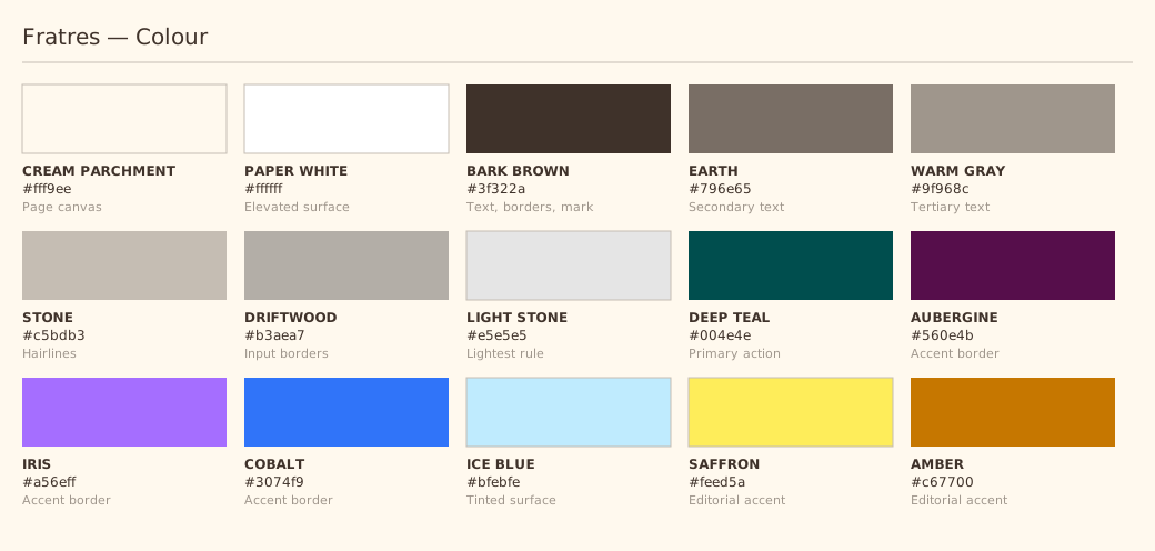
One canvas, one ink, one action colour.
Neue Haas Grotesk Display, set quietly.
Display sizes are shown capped at 43px here so the table stays readable. Body copy is set at 14px or 16px and never outside that range; 10–13px is reserved for captions, meta and labels.
Asset files.








Assets are regenerated from source by running node scripts/build-brand-assets.mjs. The mark geometry lives in src/components/Logo.tsx and is the single source of truth — change it there and rebuild.
Full-bleed landscape and architectural photography carries the emotional weight. Treatment is naturalistic and unfiltered: no duotone, no colour-grading overlay, no vignette, no flare.
Subjects are the delta, working infrastructure, and civic architecture — the physical evidence of the work rather than people performing it. Imagery is full-bleed at section openings and set in a 15px-radius frame when inset as content.
Institutional, plain, unhurried. A printed annual report, not a pitch deck. Short declarative sentences. British English.
Concrete over promotional: “approvals sit across four authorities” beats “we navigate complexity”. No growth verbs, no superlatives, no exclamation marks. Where a claim would need a number the firm does not have, describe the mechanism instead.
Need something not covered here?
Requests for additional formats, print-ready outlined artwork, or permission to use the mark in third-party material are handled through the enquiry form.
Make an enquiry